Wedding DIY: Our Invitations
/Not long after Kurt and I determined our "focus 3," we began thinking about our invitations. As someone who loves stationery and paper products, I was extremely excited about this part of the wedding planning process. To be honest it wasn't long before I was dreaming about calligraphy and embossed details, about envelope liners and enclosure cards!

Our completed invitation suite, as captured by photographer Josh Dehonney on our wedding day!
We started looking at various invitation websites for ideas and options, but didn't find ourselves connecting with anything available. At this point in our planning Kurt was in Austria and I was in Indiana and we were planning a wedding that would happen in Pennsylvania - so heading to a local invitation designer together was also not really an option. To meet this challenge I began researching possibilities that would allow us to design them ourselves.
When I found the iPad app Makr I quickly realized that it was going to answer all of our invitation woes. It was easy to use and the pre-designed templates gave us a great starting point to personalize our printed pieces. We used the app to design our save the dates, elements of our invitation suite and other printed items used throughout the wedding weekend!

Pre-designed templates made personalizing our invitations quick and easy!
As we worked on our invitations, we thought about how to introduce the Poconos to our guests, as so many of them were going to be traveling there for the first time to celebrate our wedding. Using images found on vintage postcards helped in setting the stage for our weekend while introducing our friends and family to the beautiful scenery they were going to experience in October. We used these various postcard images for our save the dates and for pieces of our invitation suite!

Each save the date included two cards. The first highlighted the wedding date.
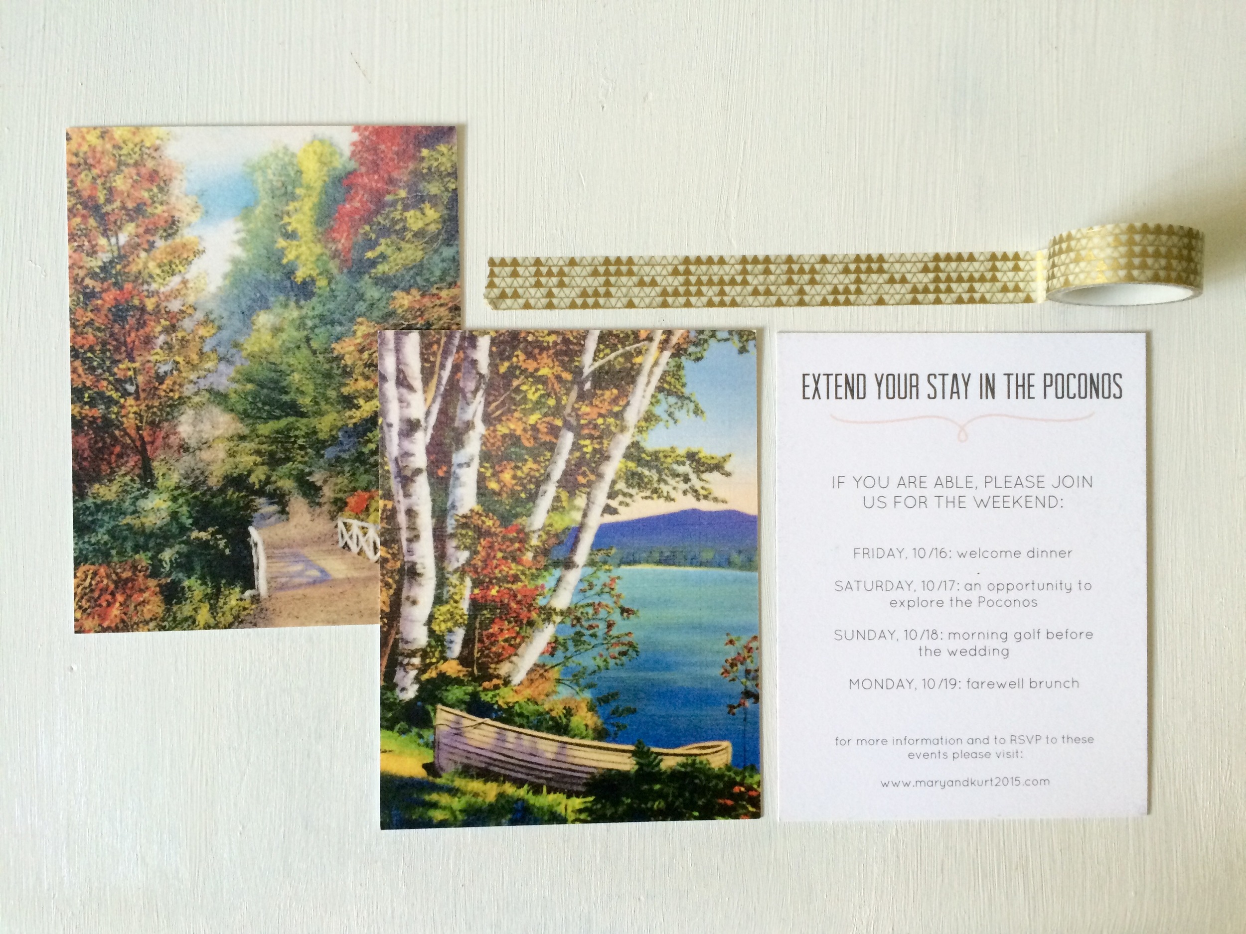
And the other shared more about what to expect from the weekend!
When we determined the color palette for our wedding, we made a conscious effort to stay away from the browns, oranges and reds typically associated with the fall. In fact, the only orange you can find on our actual invitation is the leaf at the top - a request from my dad! Instead, we focused on the berry and pink tones that are often seen as compliments to those other more traditional colors. We allowed this palette to be directly represented in our invitation suite, choosing papers from the Paper Source for their rich colors and beautiful textures. We chose Luxe Blush for the envelopes, Fig for the folder enclosures and Luxe Cream for the invitation pieces themselves.


Makr provides a couple of different options for purchasing your designs: you can download them as in-app purchases to print on your own, order and print through them directly, or, depending on your location, you can print and pick up your designs at your local Staples. We used two of these methods for various elements of our printed pieces. For the save the dates, rehearsal luncheon invitations and other items like stickers and small gift tags we printed directly through Makr. However, for our invitation pieces we chose to download the designs and print them ourselves, which allowed us to use the nicer papers we selected from the Paper Source.
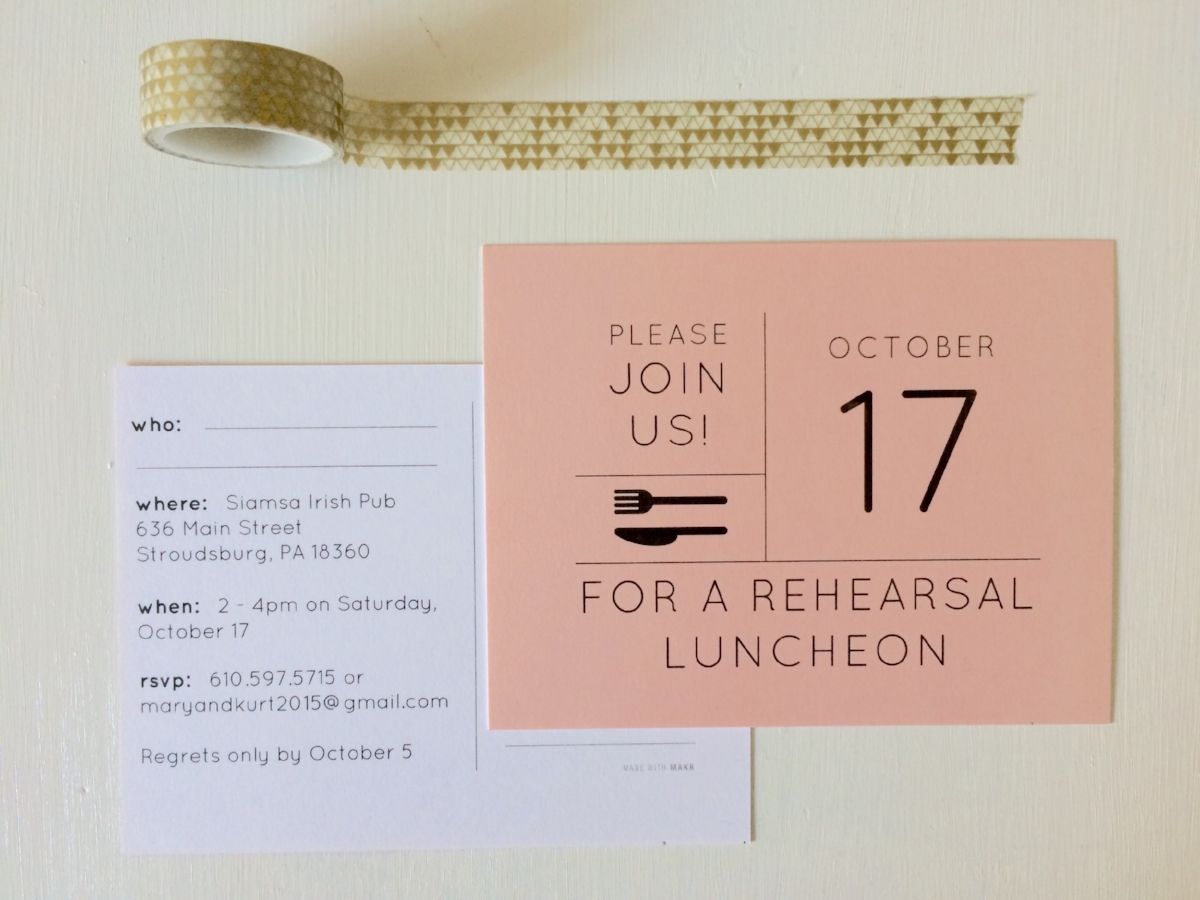
Our rehearsal luncheon invitations - a quick and easy postcard featuring the blush from our color palette!
Both of these options, printing through Makr and choosing to print things on our own, did wonders in helping us remain within our budget for this part of the wedding process. The final products were beautiful, unique and something both Kurt and I still remain extremely proud of!
To finalize our invitations, we designed a logo through Makr that was used to create a custom wax seal. We also used metallic gold brushstroke fine art paper purchased from Paper Source to line all of our envelopes. What I loved about this paper is how reminiscent it was of birch bark - it reminded me of the birch trees that circled the lake at our mountain venue!

The final touches - fine art paper to line envelopes and a custom wax seal!
Choosing to do this ourselves was an easy decision for Kurt and me because we knew it would allow us to be consistent in our design elements. Additionally, it helped us achieve an overall unified aesthetic which we had identified as very important to our "focus 3." While certain steps of this process were sometimes time consuming and frustrating, the overall project was so much more enjoyable than it was arduous.